Euro Snacks
How do you tell a younger audience, “these are the baked goods for you?” Well, first of all, you don’t use the words “baked goods.” Second, you give it an air of the adult, the worldly, the hip.
“A Taste of Paris” was a taste of success.
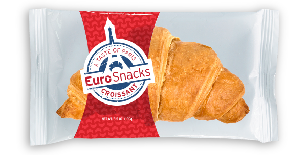
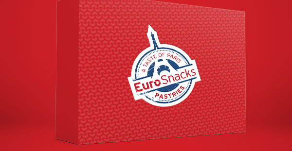
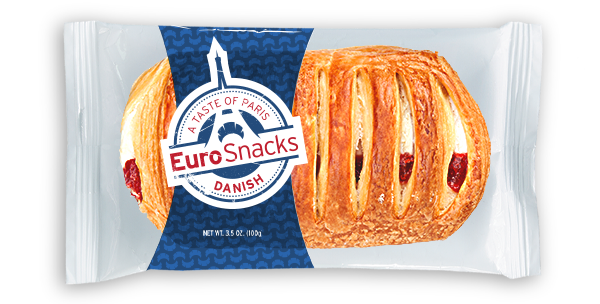
Christening the line “EuroSnacks” (because isn’t that instantly cooler than, say, “Hostess?”), we gave it the feel of a true Paris transplant, Eiffel Tower and all. The logo is realistic and slightly off-kilter, like a stamp on the passport of a world traveler. And the palette? Primary colors that pop without feeling like child’s play. C’est très chic.


